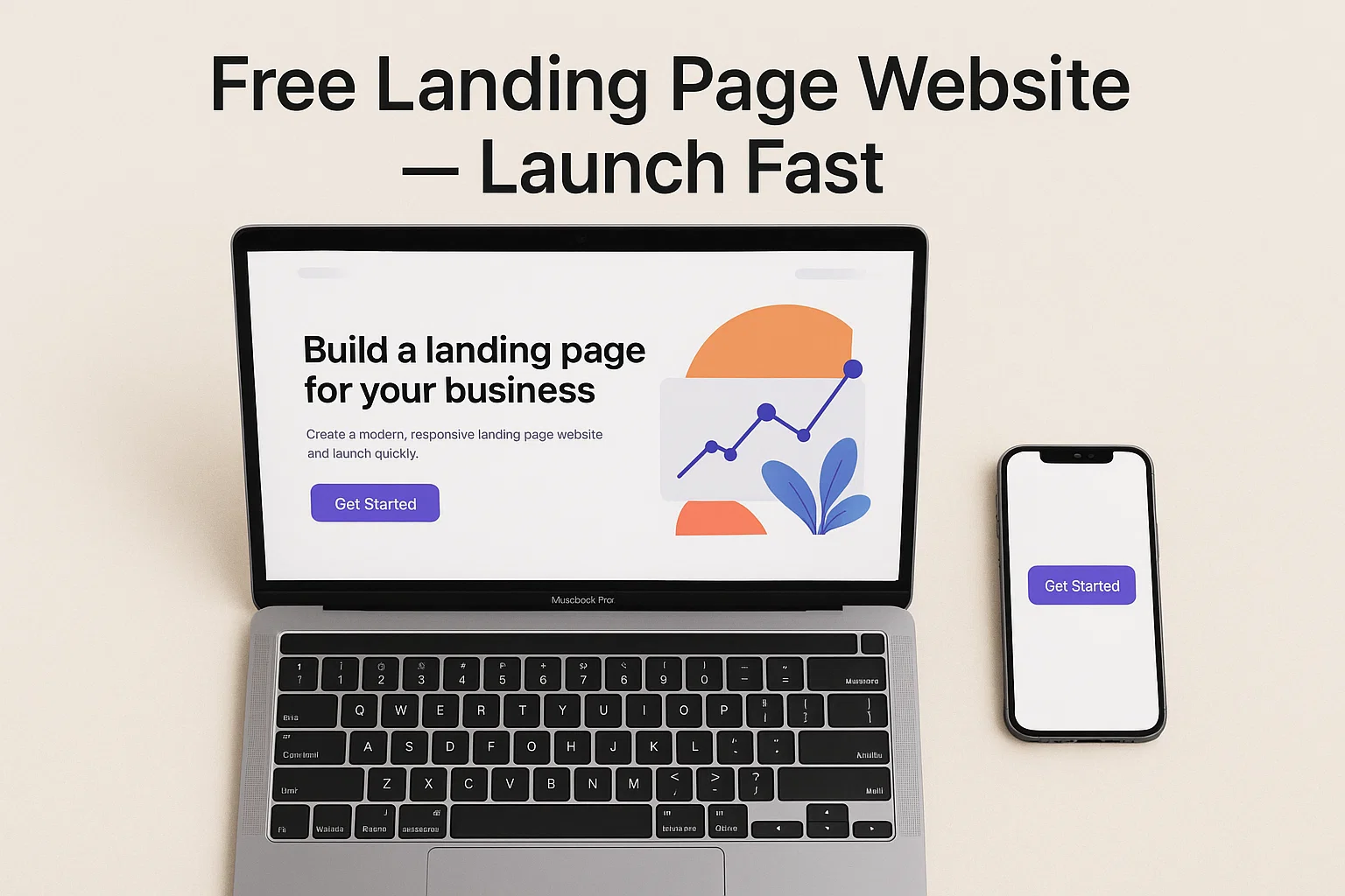
Want a free landing page website that actually converts visitors into leads, signups, or sales — without paying a designer or wrestling with code? Good news: you can have a clean, fast, mobile-ready landing page today using free templates and builders. This guide walks you through the whole thing: purpose, pick-your-tool options, step-by-step build, copy and design tips, SEO and performance checks, and launch + iterate tactics so your free landing page website works like a tiny marketer on autopilot.
I’ll keep it practical and jargon-light — think of this as your playbook. By the end you’ll know exactly which free landing page templates and hosting routes to use, what to test first, and how to squeeze better conversion from a single page.
“A landing page isn’t a website; it’s a single focused promise. Keep the promise tight and make the next step obvious.”
— copywriting truth you can use today
Why a free landing page website is the smartest first step
A landing page strips out the fluff. One page, one offer, one call-to-action (CTA). That’s everything you need when you:
- test a new product idea,
- collect early signups,
- promote a webinar or event, or
- run a Facebook/Google ad campaign.
Compared to a full website, a free landing page website is cheaper (often free), faster to publish, and simpler to optimize. And because it’s single-purpose, it’s easier to measure — you’ll know exactly which headline, hero image, or button text moves the needle.
Pick a path: builder, template, or hand-coded
There are three practical ways to get a free landing page website up:
No-code builders (fastest, best UX for non-devs)
These give drag-and-drop templates and handle hosting. Many offer usable free plans and let you connect a custom domain later. Ideal if you want the speed of a visual editor and built-in forms.
Free templates (more control, still quick)
Download a free HTML/CSS landing page template and host it on a free host (GitHub Pages, Netlify). This is perfect if you want a lightning-fast, ad-free page and don’t mind replacing images and copy.
Lightweight custom (for devs)
If you or your devs want total control, scaffold a small static site with a starter (Hugo, Jekyll, Eleventy) and deploy to a free static host. Slightly more setup but super flexible and performance-friendly.
All three approaches can produce a solid free landing page website — pick by skill level and how much customization you need.
What every high-converting free landing page website needs
Clear value proposition (headline + subhead)
Your headline must tell visitors in 3 seconds what you do and who it’s for. The subhead supports that with a brief benefit or unique point.
Single, visible CTA
Don’t bury the action. Use one primary CTA above the fold (e.g., “Get the Guide,” “Join the Waitlist,” “Start Free Trial”) and repeat it a couple of times down the page.
Trust elements
Add one or two social proofs: testimonials, logos of clients, short stats, or brief quotes from users. Social proof reduces anxiety and improves conversions.
Simple form
Ask for as little as you need. Email or phone only for most use cases. Every extra field drops conversions.
Fast loading and mobile-first
A responsive design that loads fast is non-negotiable. Mobile visitors are the majority for many niches — test on phones first.
Visual hierarchy and whitespace
Use clear sections, readable fonts, and negative space. A crowded landing page is a non-starter.
“People don’t read online — they scan. Design for scanners: bold headline, short bullets, big CTA.”
— UX rule that saves you A/B test headaches
Step-by-step: build your free landing page website in a weekend
Step 1 — Define the single conversion goal
Is the page for lead capture, app installs, course signups, or sales? Write one-sentence goal: “Collect emails for the product beta.” Everything else supports that sentence.
Step 2 — Choose your route (builder/template/custom)
If speed matters, pick a no-code free landing page builder. If you want tiny hosting costs and more speed, grab a free HTML template and host on GitHub Pages or Netlify.
Step 3 — Pick a template or theme
Look for templates labeled “lead generation,” “app launch,” or “product landing.” Prioritize templates that are responsive, have built-in forms, and include sections for features and testimonials.
Step 4 — Write the hero (headline, subhead, CTA)
Your headline should be benefit-first. Subhead gives context. Button text should be action-focused (“Get Access,” not “Submit”).
Step 5 — Add three proof elements
Use logos, a single testimonial, or a star rating. Keep these above the fold or in the section right below the hero.
Step 6 — Build the body with scannable sections
Use short bullets for features, an explainer GIF or image, a small FAQ, and then the CTA again.
Step 7 — Hook up the form
Connect your form to an email service (Mailchimp, ConvertKit, or a webhook). Test the whole flow: submit → confirmation email → deliverable.
Step 8 — Optimize performance
Compress images, use modern formats (WebP), enable lazy-loading for below-the-fold images, and remove unnecessary scripts. Test with your phone and a basic speed tool.
Step 9 — Add analytics and tracking
Install Google Analytics or a lightweight tracking pixel. Set up conversion goals or events so you can measure CTA clicks and submissions.
Step 10 — Launch and promote
Share the URL in your channels, add it to ad campaigns, or drop it in your email signature. Track conversions daily and iterate.
Copy and design micro-hacks for higher conversion
Use social proof early
A single, specific testimonial with a name and role beats a generic “trusted by hundreds.”
Lead with benefits, not features
Say “Save 5 hours/week” before “Includes bulk export feature.”
Keep CTAs specific and outcome-driven
“Download the checklist” beats “Learn more.”
Add a low-friction lead magnet
A one-page checklist, short video, or sample PDF increases sign-ups more than a blank form.
Use directional cues
Arrows, images of people looking at the form, or subtle animations steer the eye to the CTA.
SEO & organic discovery for your free landing page website
A landing page can rank — especially for long-tail queries or local terms.
- Use keyword-rich title and meta description (but keep them human).
- Add an H1 that matches user intent (don’t keyword-stuff).
- Include short FAQ with structured content — it helps search engines and voice search.
- Add schema for product, event, or local business if relevant.
- Keep page speed high — speed is a ranking and user-experience factor.
LSI keyword variations to include naturally: free landing page templates, single-page website, responsive landing page, landing page builder free, free website templates for landing pages.
Hosting options for a truly free landing page website
- GitHub Pages — host static HTML/CSS for free; ideal for template users.
- Netlify — free tier with continuous deploys from Git and easy custom domain setup.
- Vercel — great for static sites and Jamstack; free hobby tier for small pages.
- Free builder hosting — many drag-and-drop builders include a free subdomain (e.g., yourpage.builder.com).
If you want a branded domain, factor in domain cost (usually $10–15/year), but hosting can stay free.
A/B testing and iteration — the fast feedback loop
A landing page is never “done.” Run micro-tests:
- Headline A vs. Headline B
- CTA color or text changes
- Image A (person) vs. image B (product)
- Short form (email only) vs. long form (email + name)
Track conversion rate and run each test long enough to collect meaningful data. Small lifts compound over time.
“Run one test at a time. You’ll learn faster and avoid chasing bad changes.”
— practical split-testing advice
Common pitfalls and how to avoid them
- Too many CTAs: dilute action. Stick to one primary goal.
- Long forms: reduce friction — ask only for what you need.
- Generic hero images: use authentic, relevant visuals, not overused stock.
- Slow load times: compress and simplify. Every second costs conversions.
- No tracking: if you can’t measure, you can’t improve.
Launch checklist (copyable)
- Single conversion goal written.
- Compelling headline + subhead.
- Primary CTA above the fold.
- Social proof (testimonial or logo).
- Working form connected to email or CRM.
- Images optimized (WebP, lazy-loaded).
- Analytics and conversion tracking in place.
- Mobile-tested and speed-checked.
- Published on chosen free host and DNS configured if using a custom domain.
- A/B testing plan created.
Final thoughts — speedy launch, measured growth
A free landing page website gives you a fast way to validate ideas, capture leads, and run campaigns without big upfront costs. Start with a clear goal, pick the simplest route (builder or template), and obsess over one thing: the CTA. From there, measure, tweak, and scale what works.
“Launch with something imperfect today. Improve it based on real behavior tomorrow.”
— the most useful product advice